PERFORATED WINDOW GRAPHICS
While at KCB Graphics, we needed to replace the window graphics and freshen up the brand. This was a really fun project for me. The previous window graphics had been up for several years, and after a logo redesign we decided it was time to change things up. There was no foot traffic in our area, so we wanted something big and bold you could see from the road.
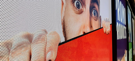
I focused this design on five main product areas, with bold colours and the faces to draw attention. Using people's faces helps connect the business with the viewer, instead of pictures of products which would not be visible from the road.
The material itself is perforated to permit those inside to see out. If you get close, you can see these holes from the outside. From a distance the artwork and colour takes over, fooling the eye and hiding those holes.
There were a few previous designs, but we kept pushing, getting a little more odd each time, removing extras until landing on this very simple but eye-catching design.